
Dataset for Practice
Download the sample cafe sales dataset:https://drive.google.com/file/d/1xKxQwesTaGBYNXbdKHkbF0fHKlZZsXA6/view?usp=drive_link
Scenario
You are the analyst for a small café. Your manager asks:
“Which product category grew fastest in Q4, and what’s the overall sales trend across the year?”
You’ll use AI to answer this question in two ways: a text-based summary (ChatGPT) and a visual chart (Datawrapper).
Step-by-Step Activities
Activity 1 – Analyse the dataset with ChatGPT
- Open the dataset in Excel or any text editor so you can see the table.
- Copy the entire dataset (headers + rows).
- Go to ChatGPT Free → start a new chat.
- Paste the dataset into the chat, and use this prompt:
“Here is a small sales dataset. Summarise the trends by product category. Which product grew fastest from Q3 to Q4, and what’s the overall yearly sales trend? Please include % changes where relevant.” - Read ChatGPT’s summary and check if it makes sense against the numbers in the table.
Expected outcome: A plain-English breakdown of sales growth, e.g., “Coffee sales grew the fastest in Q4 (+14% from Q3). Overall sales increased steadily across the year.”
Activity 2 – Create a chart with Datawrapper
- Go to Datawrapper.
- Click Start creating, and sign up for a free account.
- On the dashboard, click New Chart.
- On the next page, click Upload data → select the CSV you downloaded earlier.
- You should see your data table appear on screen.
- You should see your data table appear on screen.
- Click Proceed.
- Datawrapper will suggest chart types automatically. The chart options should look like this:
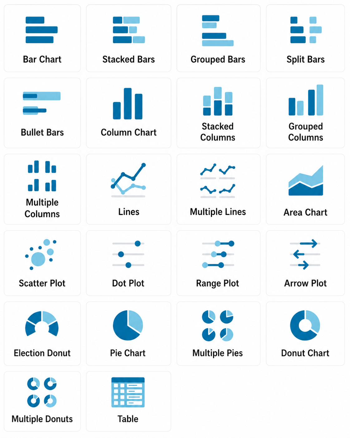
Choose Line chart or Column chart to show sales by quarter.
- On the left, assign:
- X-Axis: Quarter
- Y-Axis: Sales (€)
- Series/Group: Product Category
- X-Axis: Quarter
- Click Proceed → Datawrapper will generate the chart.
- Use the AI suggestions to refine (e.g., add title “Café Sales by Category, 2024”).
- Click Publish & Embed → choose Export as PNG.
Activity 3 – Compare and Reflect
- Compare the ChatGPT text summary with the Datawrapper chart.
- Do they tell the same story?
- If ChatGPT said Coffee grew fastest, does the chart confirm it?
- Are the % growth claims visible in the trend lines?
- If ChatGPT said Coffee grew fastest, does the chart confirm it?
- Write down one insight you trust most and one limitation you noticed in the AI outputs.